A Guide
to Style
News
style advices
and curiosity
from the world
of ceramic
Two-tone look for the kitchen this year
“Two is better than one”, they say, and this also applies perfectly to kitchen furnishings.
There are lots of trends around for 2016, but the accent everywhere is on the two-tone approach.
So it’s time for the kitchen to open up to some brand-new, original colour contrasts able to offer a lively makeover, or to bring a sophisticated, right-on-trend edge.
Teaming the predominant colour with a new shade helps to break up boring old plain, bringing plenty of charisma and character to the kitchen, whether the style is traditional or more modern.
How to make the right choice
When you have a new colour duo to choose, your own personal preferences should always be the starting point: think of the kitchen as a blank sheet you can colour just as you like. Bear in mind, however, that the structure of your home is also of fundamental importance.
For instance, for a small kitchen lacking in light, it’s preferable to choose light, neutral or pastel colours that will make it seem larger and brighter.
USE WHITE AS A “NEUTRAL BRIDGE”
Choosing three colours rather than two is a strategy often used to achieve a better visual and aesthetic balance.
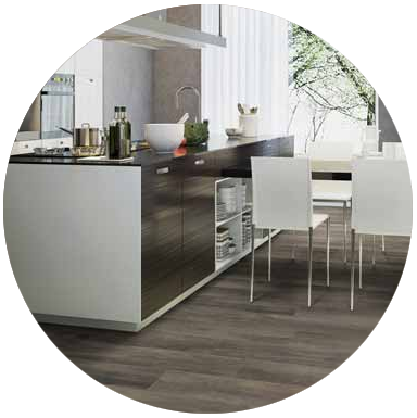
With white furniture, for instance, you can play around with shades shifting from grey to ebony for the floor and wall coverings, as shown by the Greenwood collection.
Harmony isn’t everything
For a truly original look, you can maintain neutral shades as a base, teaming them with colours able to create a sharp, bold contrast to inject a shot of energy.
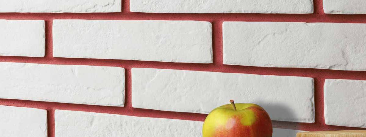
With this in mind, the New York collection in the Brick Generation project teams the classic white and black of the tiles with joints in vibrant shades such as yellow, jade green and turquoise, able to bring a fresh, lively twist to the kitchen.
MATERIAL TWO-TONE APPEAL
If a double shot of colour is a little more daring than you’d like to go, you might like to keep the one colour and play around with different textures. An example?
The new Rust series offers floor and wall coverings in coloured-body porcelain stoneware with striking material appeal.
The surfaces mimic the effect of oxidised sheet metal, rusted by time, in 28 different patterns and shades inspired by contemporary tastes – including a metallic shade, the only one in this sector – that are perfect for teaming with coloured furniture and shelves, or even with simpler, more neutral shades.