to Style
style advices
and curiosity
from the world
of ceramic
Decorating with colour
For some people, it’s a question of memories and sensations. For others, it’s all about personal tastes and preferences.
In both cases, when choosing the colour scheme for our home, we let our instinct guide us.
Bear in mind, however, that choosing the right colours, the shades able to create the perfect setting, is no easy task.
Here are a few suggestions that might help when it comes to choosing a colour scheme.
Colours in harmony
My first tip is to opt for a clearly defined set of colours, in which the shift from one nuance to another is gradual and pleasant to look at.
Choose a dominant colour for large surfaces, then dilute it into similar nuances and shades to create a consistent, smoothly blended atmosphere.
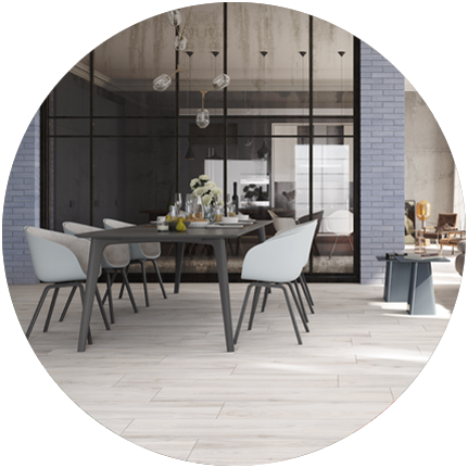
- Rondine recommends:
Cool, modern colours combine perfectly with the White shade in the Woodie collection (in the photo). The series in wood-effect stoneware, also available in warmer, more classic shades, comes in the pressed sizes 24x120 and 7.5x45 cm, as well as the innovative 7.5x40.7 Chevron tiles, which can be used to create pleasant colour effects on the floor..
Color block
For those who prefer more striking, dynamic settings, we recommend combining complementary colours, i.e. those located straight opposite one another on the colour wheel (for example yellow and violet, or red and green).
Worried the colour shock might be too much?
For a less “aggressive” combination of colours, try teaming shades that contrast with one another without being too incompatible and over the top.
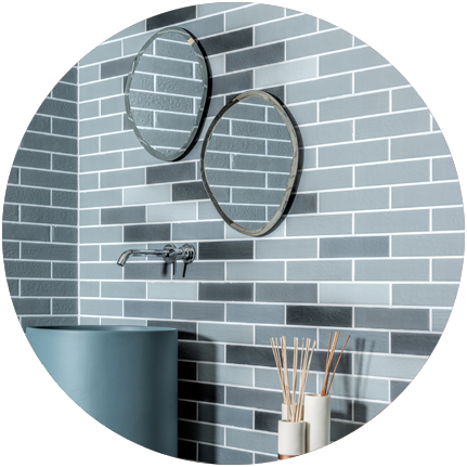
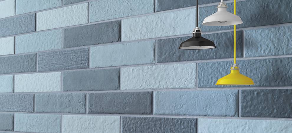
- Rondine recommends:
Urban & Colors turns your walls into an artist’s palette. The collection, in the 6x25 size, is characterised by an elegant degradé effect that brings three different hues to the brick-effect surface: Bracco (brown), Balene (blue) and Baltic (light blue) (in the photo). Urban & Colors also has NCS - Natural Colour System®© notation, to create perfect tone-on-tone and contrasting combinations on both floors and walls.
If you’re unsure, go for something classic (but not too classic!)
If you’re not sure what colours to choose, or you’re afraid you might tire of vibrant tones, go for more neutral, classic shades: when it comes to style, you can’t go wrong with white, black, beige or pastel colours.
And if you’re looking to brighten up the end result, choose a few vibrant brushstrokes of colour to break up the monochrome look and make sure you won’t get bored with it.
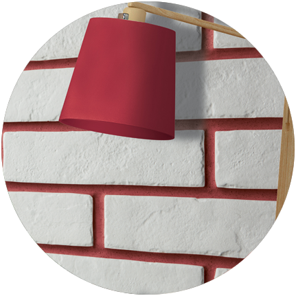
- Rondine recommends:
The sophisticated white brick tiles from the Tribeca collection (available in the 6x25 size) are the perfect complement to the red of the joints. A subtle, yet colourful, original solution, perfect for cheering up the walls of your home. Choose your favourite colour for the grouting for a vibrant, pop effect.