to Style
style advices
and curiosity
from the world
of ceramic
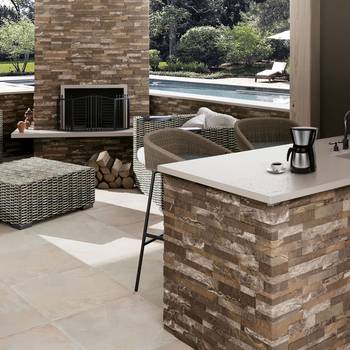
Pearl grey for walls
No colour is as versatile as pearl grey. Extremely refined and elegant, this tone with fascinating nuances is the perfect colour for walls, able to create light and highlight shapes and materials and the other tones with which it is combined.
Here are our suggestions about how to combine it best.
In harmony
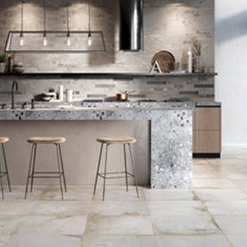
Pearl grey is often wrongly considered as a colour which is too conventional and excessively cold but, on the contrary, it’s a shade that catches the eye and makes an impact. Ideal for creating refined chromatic scales, it perfectly combines with other darker, softer and powdery shades of grey.
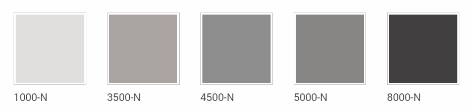
The result will be an attractive scale of greys, intense, delicate and adapted to every style you’ve chosen for your home, from the most modern to the most classic. The photo shows an example of our Icon collection for floors and the tone-on-tone from the NCS– Natural Colour System®©.
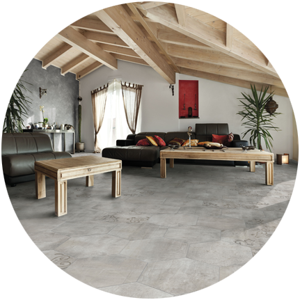
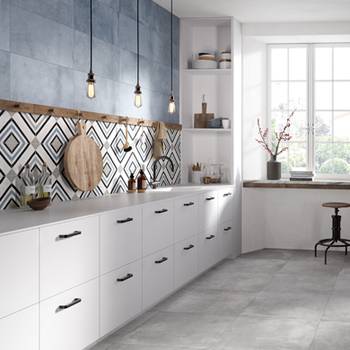
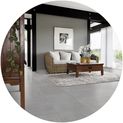
In contrast
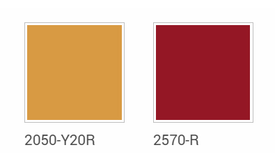
Perfect with white or with neutral shades, pearl grey is also ideal for combining with stronger, bolder colours to give rooms a more modern feel. Chosen as the colour base for your walls, when combined with bright shades for furnishings, such as red or mustard marked by NCS ®©, it will lend the room an interesting and tasteful atmosphere.
The combination with black or brown is also timeless and extremely elegant.