to Style
style advices
and curiosity
from the world
of ceramic
The two faces of Colour Blocking
The term colour block conjures up images of glaring, bold shades used in a fanciful roulette of colours with a guaranteed "pop" effect. Bold colour combinations always work, provided they are dosed skilfully alongside the other furnishing elements, particularly considering the general colour scheme chosen for the wall and floor coverings. In this case, there are two possibilities: either to use colours of the same tone together or to remain faithful to the literal (and more shocking) definition of colour blocking.
Let's take a look at both.
In Harmony
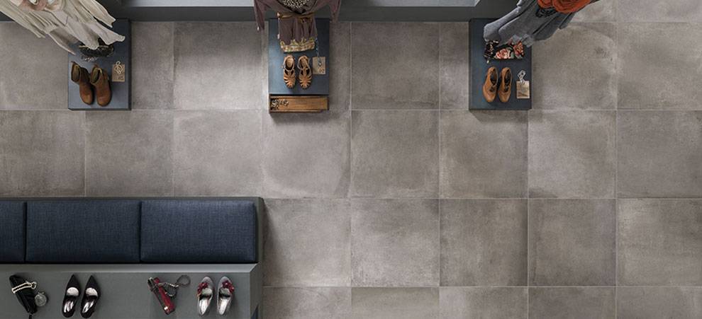
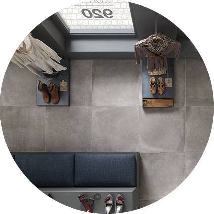
Contrasting yet similar colours: take the colour chosen for your flooring and match it with shades that belong to the same "family" in the colour spectrum. In other words, if your general colour scheme is warm, stick to warm shades; mix colder hues with other cold shades.
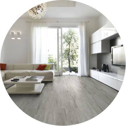
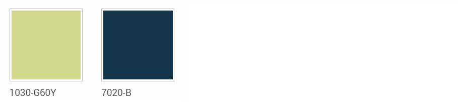
The example provided here shows the combination of the NCS– Natural Colour System®© notated blue, chosen for the furnishing accessories, and the Piombo grey of our collection Amarcord in the size 60.5x60.5 The colour blocking effect created is very elegant, not at all glaring, with a mixture of colours that creates a sophisticated, warm atmosphere that is almost cosy.
By contrast
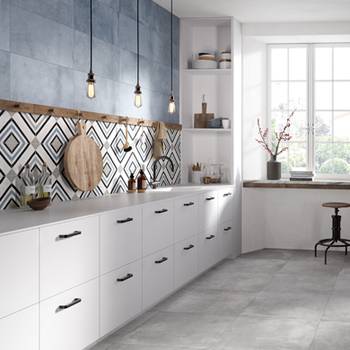
For those who are not put off by more sparkling, flamboyant contrasts, traditional colour blocking transforms the home into an artist's palette. So, give the green light for coloured details: like a splash of colour here and there, they create a clean break from the main colour scheme to create an original mixture with a bold visual impact.
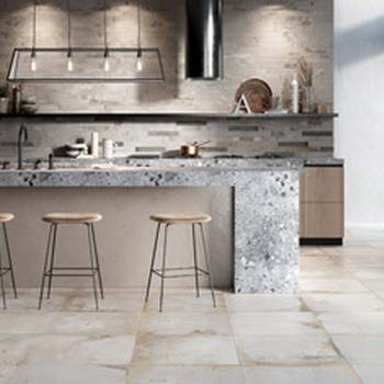
The example shows how the bright NCS ®© shades chosen for the furnishing accessories can add a vibrant touch to the room, which is dominated by the cosy shades in the shades of Fumo in our Visual floor tiles. The final result is a highly modern, trendy living environment.